✨ Impact Statement
I designed 6 signature watch faces for the Galaxy Watch 6 and Watch 6 Classic that launched globally, helping reposition the watch as Samsung’s “Best Health Watch.” The project introduced a flexible visual and motion system now extended into Watch 7 and used as internal references for future personalization and wellness design.
🎯 My Role
Visual & Motion Designer (2021–2022)
Led concept development, motion direction, and system design
Collaborated with platform PM, hardware team, and global UX leads
Delivered assets and motion guidelines across multiple SKUs
🧩 The Challenge
How might we create signature watch faces for Galaxy Watch 6 that celebrate its thinner bezel and position it as the “Best Health Watch” while supporting personalization, wellness, and visual self-expression?
With its 2mm slimmer bezel and larger screen, Watch 6 offered a unique canvas to design watch faces that felt more immersive, emotionally resonant, and expressive.
We aimed to shift away from flat digital dials and toward living, breathing surfaces that support self-care and personalization.
🧠 Insights & Research
We grounded our approach in user-centered creative strategy, aligned to 3 key audience types:
Persona | Focus | Needs |
|---|---|---|
🧘♀️ Wellness Warrior | Sleep, mindfulness, calm | Guided breathing, wind-down support, low motion |
🧑💼 Trend Chaser | Tech, motion, bold UI | Dimensional design, interactive moments |
🎨 Culture Conscious | Identity, self-expression | Personalization, vibrant color, unique forms |
We explored:
📝 50+ sketches across themes of identity, play, and wellness
🧠 Emotional goals: calm, motivation, pride, self-care
🎨 Material + motion studies for tactile, ambient rhythm
🤝 Tight hardware and platform alignment to optimize motion and UX
💡The Vision
“Let every watch face reflect a different kind of intention—sleep, play, movement, or identity.”
Our vision was to move away from static digital dials and toward faces that breathe with you, evolve over the day, and feel personal and dimensional. Each design had to feel alive—whether helping a user wind down, express their style, or track goals.
We used 6 visual principles to guide design:
Dimensional: Simulated depth, shadows, and layering
Tactile: Real-feeling materials like sand, marble, liquid
Graceful: Fluid, calming animations
Expressive: Monograms, color themes, and visual storytelling
Responsive: Time-of-day shifts, activity-based motion
Unexpected: Delight through interaction or surprise
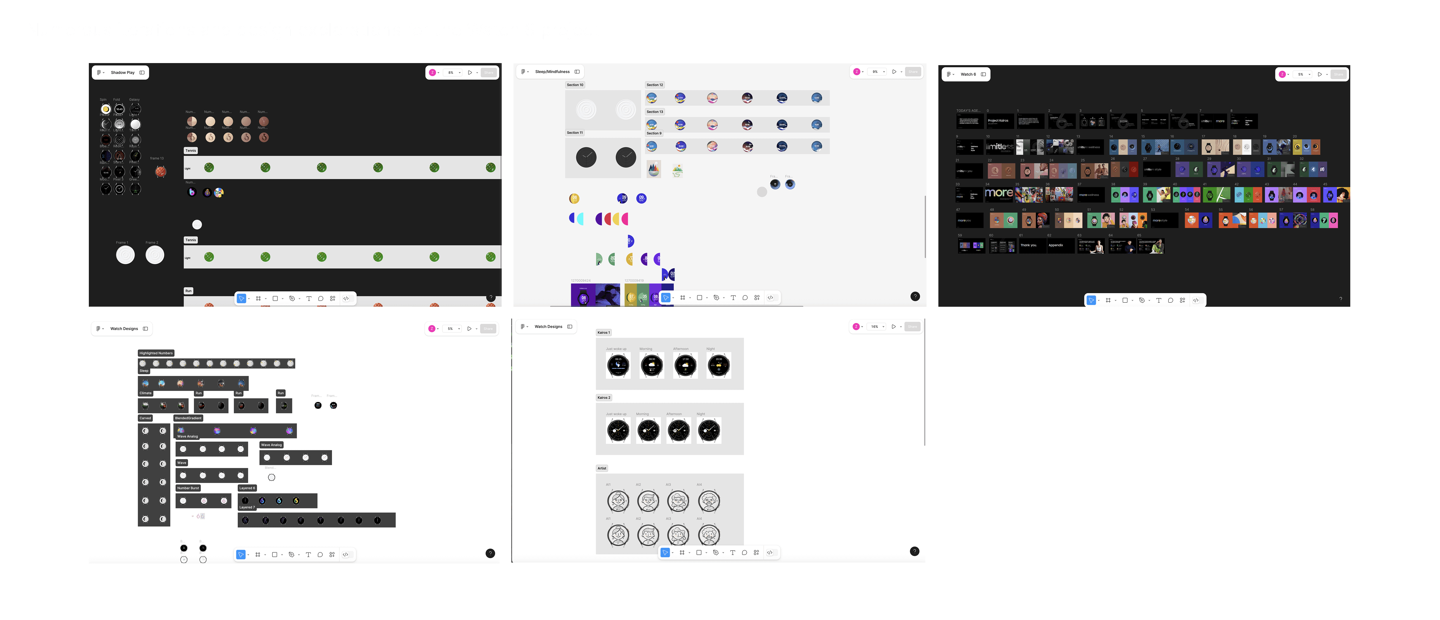
🎨 Design Process
Sketch & Explore: Dozens of initial concepts mapped to mood and behavior
Visual System Design: Developed unified texture, motion, and lighting language
Motion + Interaction Testing: Explored tilt, wrist, tap interactions
Concept Validation: Final face selections presented to execs and included in Galaxy Watch 6 launch lineup
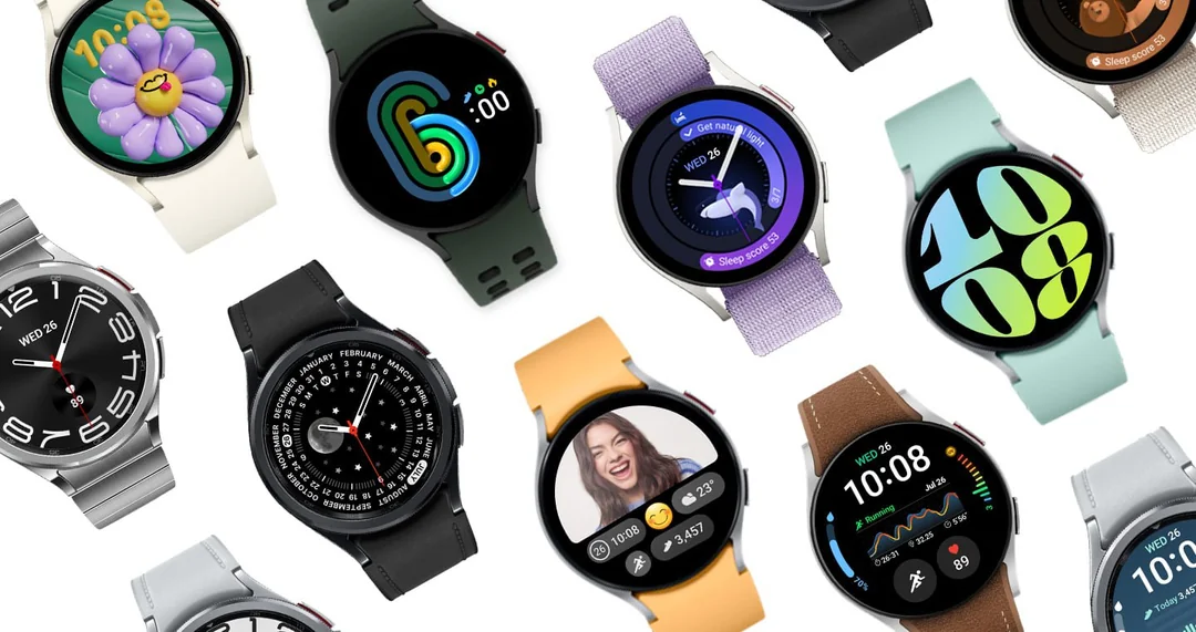
✨ Final Experience Highlights
🌙 Sleep Story | 🔤 Signature Monogram |
|---|---|
|
|
🌀 Depth Steps | 🌊 Zen Trails |
|
|
⚪ Bezel Ball | 💧Sensory Bubbles |
|
|
🏁 Outcome
✅ Multiple faces launched with Galaxy Watch 6 & Watch 6 Classic, including:
Sleep Story
Zen Trails
Depth Steps
Bezel Ball
Signature Monogram
Sensory Bubbles
📣 Helped establish Watch 6’s positioning as Samsung’s “Best Health Watch”
🧱 Built a flexible visual and motion system extended into Watch 7
🏆 Used as internal references for future personalization and wellness features
🧠 Reflections
✅ Watch faces are emotional real estate—they reflect your mood, goals, and self-image
✅ People respond strongly to ambient motion, tactility, and story-based design
✅ Designing for the wrist is about small moments of connection—rhythmic, responsive, and human
✅ Sleep Story and Monogram taught us that identity + coaching can live beautifully together