📌 Project Scope
Timeline: 6 months (research to rollout)
Team: I partnered with a UX researcher, two engineers, and a PM. I led design strategy and execution, while the researcher drove studies, engineers stress-tested feasibility, and the PM ensured stakeholder alignment.
Tools: Sketch, InVision, Zeplin, GitHub
Deliverables: Component library, documentation site, onboarding materials, training workshops
Collaboration Snapshot
Researcher → Led audits, interviews, and lab observations
Engineers → Stress-tested atomic components and ensured scalable build
PMs → Aligned stakeholders and supported global rollout
Clinical Staff → Validated workflows and usability in lab settings
My Role → Drove design strategy, defined visual/interaction language, and facilitated adoption across teams
🔍 The Challenge
Abbott Diagnostics serves a wide range of enterprise users in clinical labs, where the stakes are high and workflows are dense. But across its diagnostic software platforms, UI fragmentation had become a growing problem. Each product looked, felt, and behaved differently. This created longer onboarding times, higher cognitive load, and inconsistent experiences for healthcare professionals who needed reliable, fast tools.
This need was voiced across teams: engineers were frustrated by re-implementing components, clinical staff flagged inconsistencies in workflow handoffs, and PMs wanted more predictable velocity. Our design system effort was shaped by input from all of them. But this wasn’t just about consistency—it was about creating a scalable system that worked for complex, high-stakes data environments.
🚀 My Role
As Lead Designer, I drove the vision and execution while collaborating closely across functions. I partnered with our researcher to translate lab insights into interaction patterns, worked with engineers to ensure scalable implementation, and aligned with PMs and clinical experts to balance business needs with usability.
Conducted design audits across product platforms
Defined the visual and interaction language
Designed modular components in Sketch and InVision
Collaborated with product, engineering, and clinical teams to ensure alignment and feasibility
Built the documentation library
Delivered internal onboarding, training, and rollout support across teams
📈 Audit & Research
We began with a deep audit of over 100 screens across AlinIQ Analytics, BIS, AMS, and Workflow. Each product had its own UI logic, even when solving similar problems—causing usability friction and increasing cognitive load. In fact, 70% of screens lacked standardized components, leading to longer onboarding and wasted engineering time due to re-creation of similar UI elements.
Our audit revealed over 70% of screens lacked standardized components—leading to longer onboarding, visual inconsistencies, and wasted engineering effort.
Our researcher led interviews and workflow shadowing, and I joined sessions to translate pain points into design requirements. Engineers also participated, surfacing technical debt from redundant builds. This triangulated view shaped our north-star principles. Through that research, we learned:
Staff often kept handwritten notes to bridge gaps between tools
Inconsistent interfaces made it harder to spot diagnostic patterns
Development teams were building the same things from scratch in silos
We also benchmarked industry leaders—studying Google’s Material Design, IBM’s Carbon, and Shopify’s Polaris—to ensure our system was scalable, accessible, and well-documented.
Studied industry leaders like Material Design, Polaris, and Carbon to learn best practices for scalable component libraries
UMS Flow

Redesigned UMS diagnostic flow—mapping ordering patterns, filters, and visual roll-ups to support real-world lab decision-making.
⚖️ Design Strategy & System Architecture
I facilitated workshops with engineering and product to align on atomic design principles. This allowed us to co-create rules engineers could implement efficiently while still meeting PM and brand requirements. By treating every design element—from buttons to dashboards—as modular, reusable building blocks, we created a system that could scale seamlessly across platforms, teams, and use cases.
This approach allowed us to:
Speed up cross-team development and design cycles
Reduce redundant UI specifications by over 60%
Empower engineering teams to build with fewer dependencies and greater consistency
Our system was also designed to meet critical product and organizational needs, including:
Multi-platform compatibility (desktop, tablet, mobile)
Built-in WCAG AA accessibility standards
Alignment with Abbott’s branding, development velocity, and regulatory compliance requirements
Grid System
Foundational grid layouts across desktop and tablet platforms—establishing spatial harmony and consistent layout rules for AlinIQ applications.
Global Navigation

Primary and secondary navigation patterns designed for cross-app consistency across BIS, Workforce, and Insights modules.
Platform Navigation
Systematized left-rail and global navigation for scalable platform use across different user roles and product tiers.
✏️ Design Process
To build a system trusted by both lab staff and engineers, I led a cross-functional process: the researcher and I tested patterns with lab professionals, engineers validated feasibility in working sessions, and PMs ensured we tracked toward roadmap priorities.
Defined guiding principles focused on clarity, simplicity, and brand trust
Created modular, reusable components tested for real-world feasibility
Documented everything through dual tracks:
Style — visual standards, tokens, spacing, branding
Usage — interaction patterns, do’s & don’ts, accessibility guidance
Ran iterative usability tests with clinical users and engineering to refine patterns
Delivered onboarding workshops, reference kits, and change logs to support scalable adoption
🌟 Design Foundations: Atoms
We built out base elements with accessibility, medical clarity, and reuse in mind. Each was versioned and documented with rationale.
Colors: AA-compliant brand palette with clear hierarchy for UI and data visualization
Typography: Work Sans and Roboto type systems mapped for desktop and mobile
Buttons: Primary and secondary styles with hover states and icons
Inputs: Standardized fields, dropdowns, checkboxes, and datepickers
Filters: Multi-layered filtering that supports complex queries
Pagination, Tabs, Labels, Iconography: Designed with consistency and clarity in mind
Colors
AA-compliant brand color palette with visual hierarchy for UI, data visualizations, and supporting elements.
DS Color
Expanded color rationale showing how we mapped semantic meanings to functional UI roles—warnings, confirmations, neutrals, and highlights.
Typography
Work Sans and Roboto type systems mapped across desktop and mobile editorial experiences.
Buttons
Primary and secondary button styles with hover states, icons, and accessibility guidelines.
Inputs
Standardized text fields, dropdowns, checkboxes, and datepickers to reduce learning curve across platforms.
Pagination
UI pattern for consistent date navigation—scaling from week to year views.
Filters
Multi-layered filters enabling complex queries while retaining scannability and hierarchy.
Iconography
Atomic-level icon system supporting navigation, data sorting, and action indicators.
Tabs
Active tab behavior and hover interactions designed for platform-level visibility and clarity.
Labels
Tag-style labels for filtering, metadata clarity, and accessibility.
📊 Components in Context
We turned atomic building blocks into high-functioning organisms:
Cards: Data summaries, visual roll-ups, and progress indicators
Data Tables: High-density, editable tables with smart filters
Visualizations: Styled line graphs and histograms for diagnostic clarity
Cards
Dashboard card templates: data summaries, progress indicators, and visualization-ready layouts for analytics and diagnostics.
Data Tables
Multi-purpose data tables with editable fields, filters, expandable rows, and pagination designed for high-density content use cases.
Data Visualizations
Line graphs, histograms, and scatter plots styled with standardized spacing, annotations, and color logic for clinical clarity.
🔊 Voice & Tone
Voice and tone guidelines ensured all interactions—from error states to tooltips—reflected Abbott’s ethos: clear, human, and professional.
Voice & Tone
Voice and tone system aligned with Abbott brand: friendly, helpful, and clear—critical in medical software communications.
Summary Data Visualization
Histogram templates that adapt to 21:9 and 16:9 displays while preserving legibility, hover insights, and actionability for lab decision-making.
🧩 Real-World Application: Enterprise-Grade Interactions
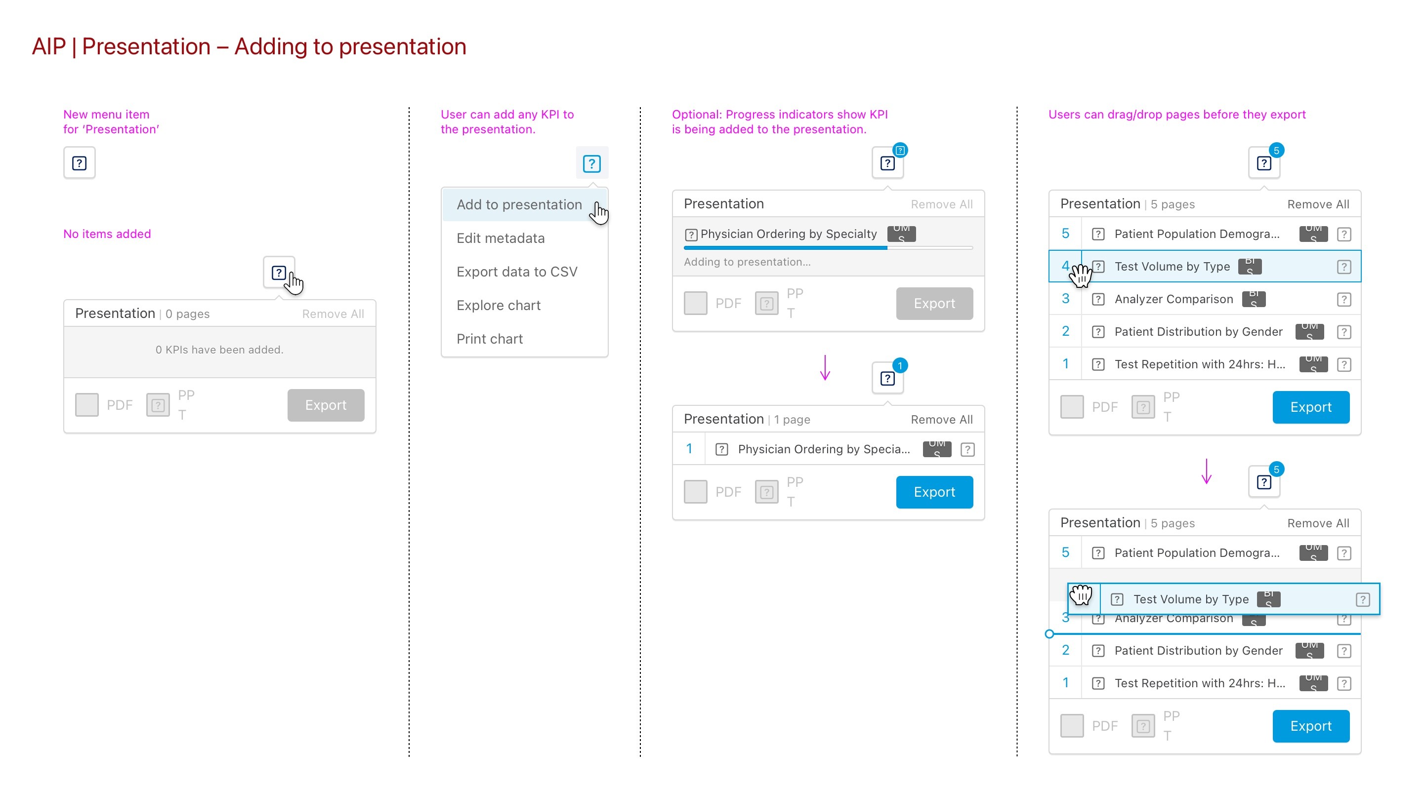
📊 Presentation Builder Flow
One of the first major applications of our design system was a high-impact feature designed for clinical users: the Presentation Builder. This flow helped users assemble custom KPI reports by combining charts and visualizations into downloadable decks.
We applied system-standard components like dropdowns, tooltips, drag handles, and progress indicators to ensure consistency and reduce development lift. Because these patterns were already documented in our system, engineers could implement them efficiently while maintaining cross-platform consistency.
The Presentation Builder Flow demonstrated how our design system enabled scalable enterprise UX.
We reused modular components—dropdowns, tooltips, drag handles—across platforms, reducing engineering lift and preserving consistency.
🏥 Designed for Enterprise Users
This feature supported clinical and lab operations teams responsible for sharing insights across departments. These users needed a streamlined way to:
Add relevant charts to a presentation deck
Control the export order
Choose between PDF or PowerPoint formats
This interaction was tailored for lab managers handling data-intensive tasks under time constraints.
The flow was built to balance speed with accuracy, accommodating complex team workflows without sacrificing usability.
I designed a persistent “Presentation Tray” that supports multi-selection, shows real-time progress as items are added, and allows for drag-and-drop reordering before export. This minimized redundant clicks while still supporting high-stakes precision.
🤝 Cross-Functional Collaboration and Iteration
I partnered with engineers and clinical stakeholders to design the Presentation Builder flow. For example, usability tests run by our researcher surfaced confusion around export feedback, which we solved by adding animated status messaging. PMs championed rollout across global teams, ensuring adoption beyond the pilot. Usability testing surfaced key pain points—like reorder confusion and unclear export feedback—which we addressed through animated status messaging and simplified interactions.
The flow itself was designed for clinical users who export KPI dashboards—balancing precision and ease. Through iterative testing and cross-functional input, we refined logic, added visual feedback, and accelerated rollout.
“This fixed what used to take me 3 steps,” said a clinical user in Frankfurt.
These small touches made the story more human—and the system more relatable.
🗓️ Calendar Components in Context
Following the success of Presentation Builder, we extended our system principles into another critical area: date selection and reporting tools. These calendar components supported a wide range of enterprise workflows—from basic scheduling to KPI comparison and analysis.
To support advanced reporting and lab scheduling tasks, we designed and documented a suite of reusable calendar patterns that balanced flexibility with clarity. Each variant reused atomic tokens, spacing, hover/active states, and interaction logic defined in the system.
1. Simple Date Selection
Designed for fast, single-day interactions—such as selecting a test result date or logging activity
Used across dashboards and appointment tools
Hover and click states provided clear interaction feedback
WCAG-compliant contrast and focus indicators
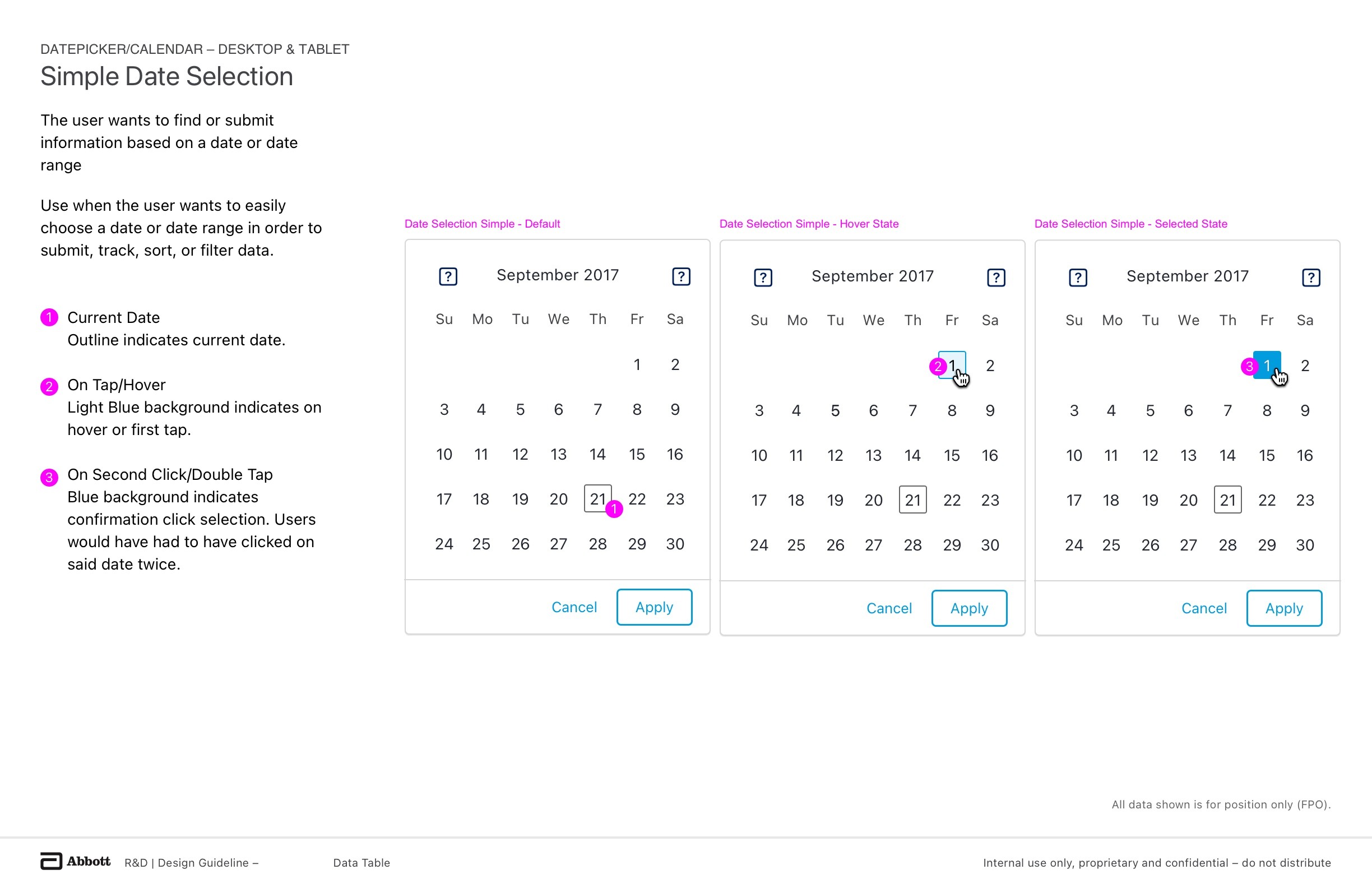
Used in appointment scheduling and test result filtering. Designed for clarity and speed with built-in accessibility states.
2. Basic Date Range Selection
A robust pattern for selecting start and end dates in workflow filtering, report generation, and ordering flows
Inline mask formatting improved input accuracy
Users could type or pick from the calendar
Active states, tap logic, and second-click confirmation ensured clarity
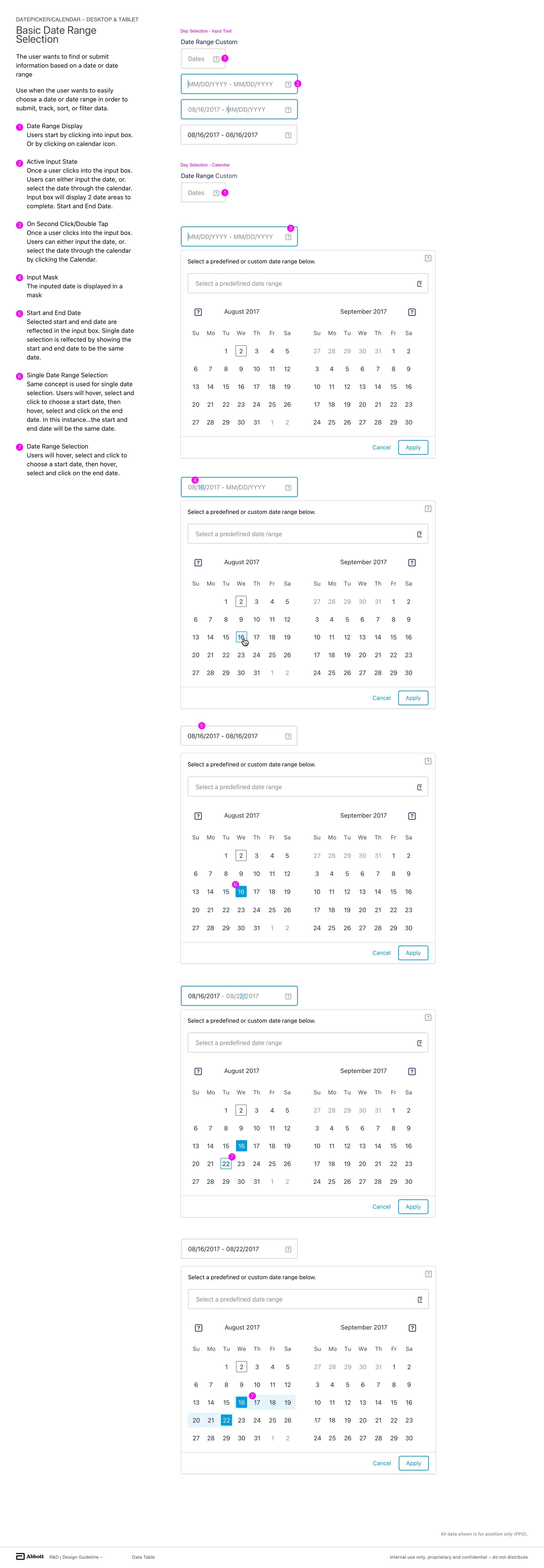
A core filter interaction for time-based reporting tools. Visual clarity was prioritized, with hover feedback and semantic focus.
3. Multiple Date Range Selection
Built for advanced clinical users who need to track and compare performance over multiple time periods
Allowed users to select multiple custom date ranges in one interaction
Applied chips updated in real time as selections were made
Used in data analysis flows to reduce toggling between date pickers
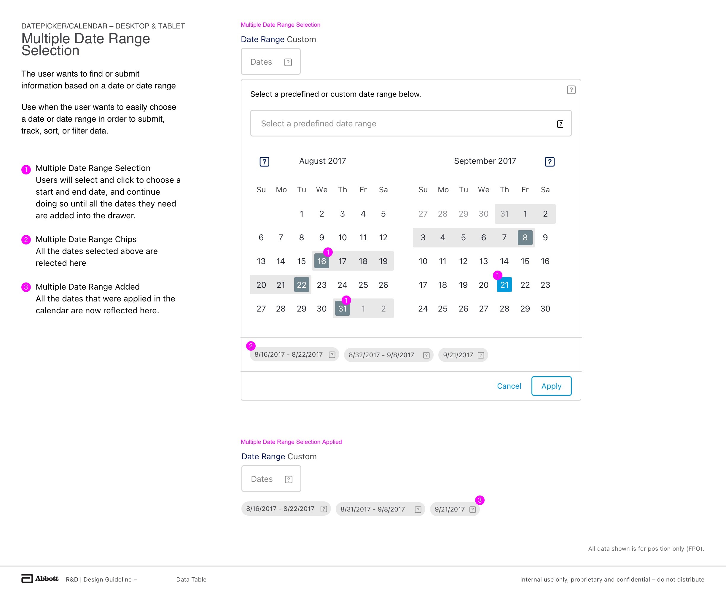
A more advanced interaction for power users needing to track multiple KPI windows simultaneously. This design balanced complexity with clean, flexible UI patterns.
4. Date Range Comparison with Period Logic
A specialized pattern created to support year-over-year and quarter-over-quarter analysis
Included dropdown logic for selecting comparison presets (Last Quarter, Year Over Year)
Highlighted and labeled comparative time ranges visually within the same calendar view
Final selection chip surfaced both primary and comparison windows
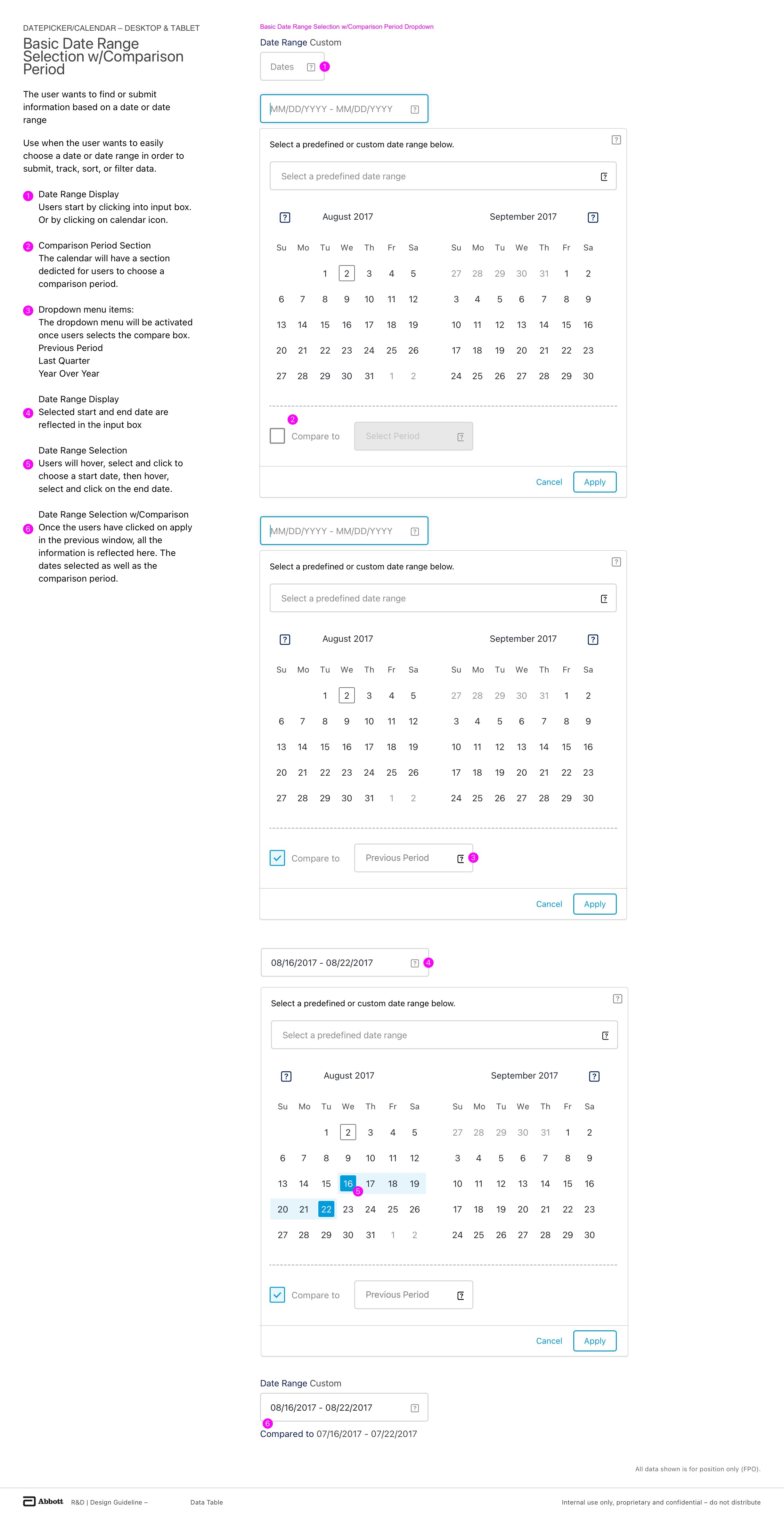
Each of these modules reused tokens, spacing, icons, and interaction states defined in the core design system. The result: less design and engineering overhead—and more time saved for users under pressure.
✅ The calendar work reinforced our system’s power to support diverse enterprise workflows—from quick selects to multi-layered comparisons—while reducing complexity, increasing confidence, and driving clinical efficiency
🔄 Iteration & Refinement
We used feedback loops and working sessions to test everything from icon sizing to form padding.
✅ Outcome
Together, our cross-functional team replaced ad-hoc UI decisions with a strategic, research-backed system. My contribution was leading the design vision and principles, but it was the collaboration with researchers, engineers, PMs, and clinical users that made it stick across Abbott’s ecosystem.
Reduced redundant UI specs by 60%
Cut new product dev time by ~25%, and dashboard build time by 50%
Shortened onboarding and reduced UI-related support tickets
Standardized accessibility and embedded inclusive design practices from the start
Empowered cross-functional teams to build faster—with consistency and confidence
More than just a component library, AlinIQ became a force multiplier—accelerating delivery, reducing errors, and improving the experience for the people who matter most: medical professionals on the frontlines.